Code
library(gapminder)
library(tidyverse)
library(plotly)library(gapminder)
library(tidyverse)
library(plotly)gapminder_data=gapminder
glimpse(gapminder_data)Rows: 1,704
Columns: 6
$ country <fct> "Afghanistan", "Afghanistan", "Afghanistan", "Afghanistan", …
$ continent <fct> Asia, Asia, Asia, Asia, Asia, Asia, Asia, Asia, Asia, Asia, …
$ year <int> 1952, 1957, 1962, 1967, 1972, 1977, 1982, 1987, 1992, 1997, …
$ lifeExp <dbl> 28.801, 30.332, 31.997, 34.020, 36.088, 38.438, 39.854, 40.8…
$ pop <int> 8425333, 9240934, 10267083, 11537966, 13079460, 14880372, 12…
$ gdpPercap <dbl> 779.4453, 820.8530, 853.1007, 836.1971, 739.9811, 786.1134, …准备数据
gapminder_data_cn_us_2007=gapminder_data %>%  filter(country %in% c('China','United States')) %>% filter(year==year)

gapminder_data_cn_2007=gapminder_data %>%  filter(country %in% c('China')) %>% filter(year==year)

gapminder_data_2007=gapminder_data %>% filter(year==2007)

glimpse(gapminder_data_cn_us_2007)
Rows: 24
Columns: 6
$ country <fct> "China", "China", "China", "China", "China", "China", "China…
$ continent <fct> Asia, Asia, Asia, Asia, Asia, Asia, Asia, Asia, Asia, Asia, …
$ year <int> 1952, 1957, 1962, 1967, 1972, 1977, 1982, 1987, 1992, 1997, …
$ lifeExp <dbl> 44.00000, 50.54896, 44.50136, 58.38112, 63.11888, 63.96736, …
$ pop <int> 556263527, 637408000, 665770000, 754550000, 862030000, 94345…
$ gdpPercap <dbl> 400.4486, 575.9870, 487.6740, 612.7057, 676.9001, 741.2375, …gapminder_data_cn=gapminder_data %>% filter(country %in% c('China')) %>% filter(year==year)
gapminder_data_us=gapminder_data %>% filter(country %in% c('United States')) %>% filter(year==year)
gapminder_data_cn_us=gapminder_data %>% filter(country %in% c('China','United States')) %>% filter(year==year)中国人均GPD的线性图
GGplot
ggplot(data=gapminder_data_cn, aes(x=year, y=gdpPercap)) +
  geom_line()+
  geom_point()
Plotly
中国人均GPD的线性图,修改线的形状,颜色和大小
GGplot
ggplot(data=gapminder_data_cn, aes(x=year, y=gdpPercap)) +
 geom_line(linetype = "dashed", color = "#0099f9", size = 2)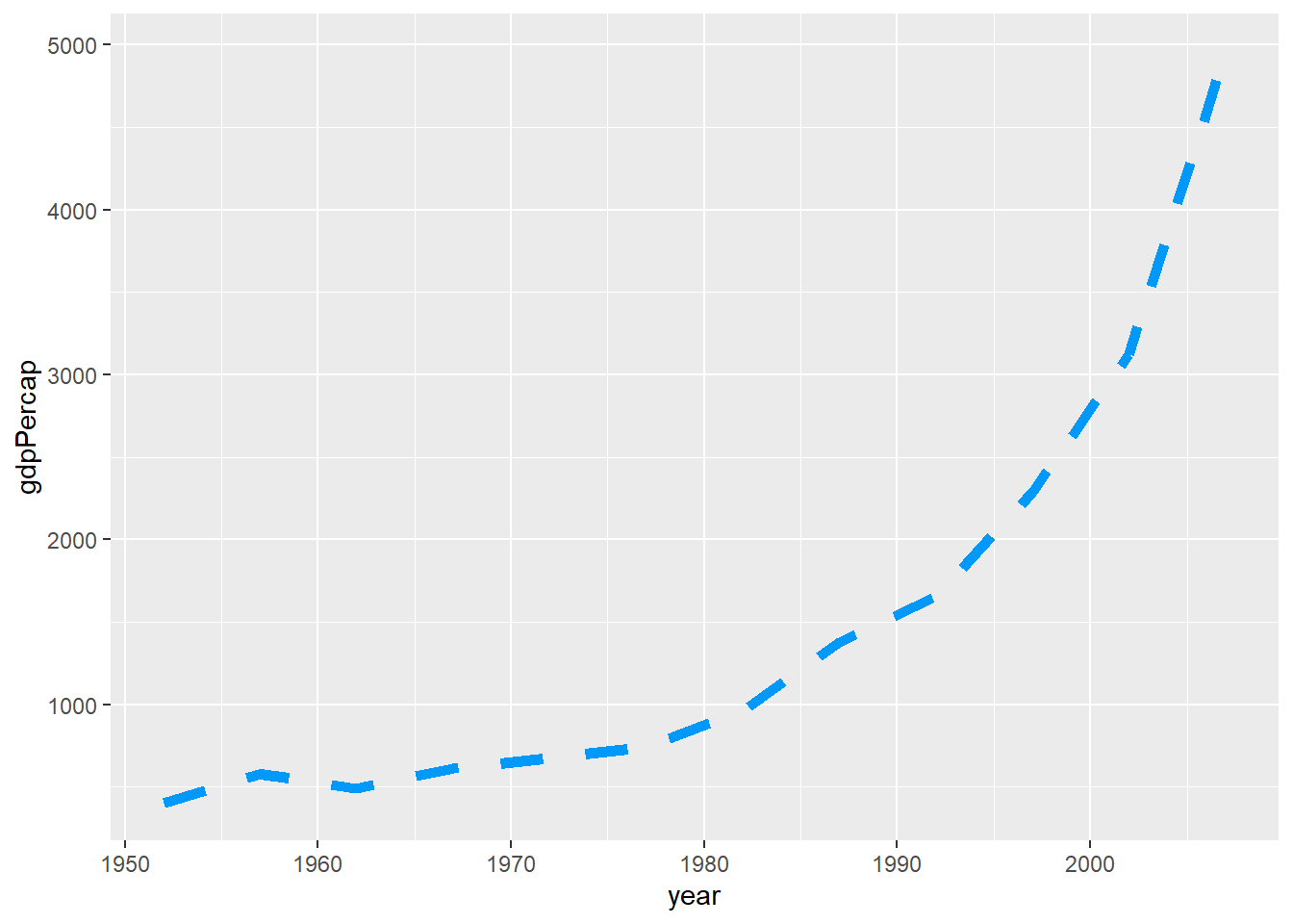
Plotly
中国VS美国人均GPD的线性图
GGplot
ggplot(data=gapminder_data_cn_us, aes(x=year, y=gdpPercap,color=country)) +
  geom_line()+
geom_point()ggsave("feature.png")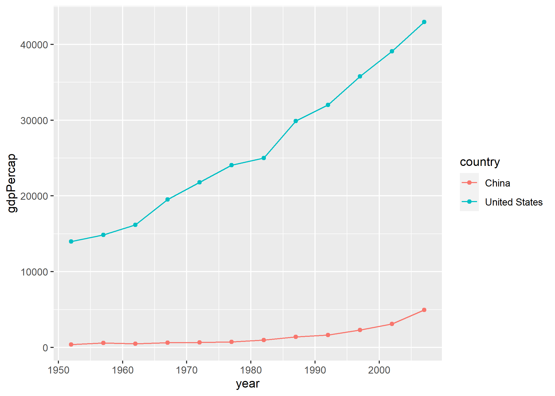
Plotly